Close Menu

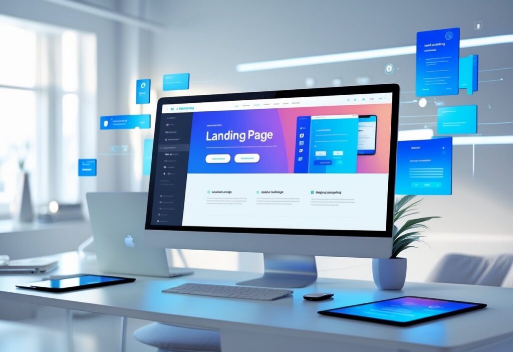
Website redesigns can drag on forever, delays, unclear feedback, endless revisions. Smart prototyping flips the script. Teams get to build early versions, test ideas fast, and tweak things before sinking time into full development. It’s a huge time-saver and gets a better marketing site live, faster.

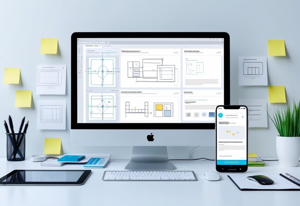
With the right UX prototyping tools, marketers can actually see layouts and user flows, no more waiting for a finished product to get a feel. Prototypes show off interactive features, so everyone’s on the same page. That means quicker decisions and less of the back-and-forth that usually drags website projects out.

When marketers lean into smart prototyping, they can test early, spot issues, and focus on what matters most. This keeps projects moving and makes for a way better user experience. Learning how to work prototyping into a redesign isn’t just smart, it saves money and gives everyone more confidence in the end result.

Key Takeaways

  • Early prototypes mean faster feedback and quicker redesigns.
  • Visual tools help marketing and design teams work together better.
  • Focusing on user needs in prototypes leads to stronger websites.

Smart Prototyping: Transforming the Website Redesign Process

Smart prototyping makes website redesigns way less painful. Teams can quickly build, test, and tweak ideas before jumping into full development. It brings order to messy projects and helps everyone avoid expensive mistakes.

How Website Prototyping Accelerates Marketing Website Redesigns

Prototyping lets you see early, hands-on versions of a new site. Marketers and designers can sketch out wireframes or build interactive mockups, no code needed. This makes it easier to spot usability problems and messaging gaps right up front.

Testing these prototypes with users or stakeholders brings fast feedback. That means fewer last-minute fire drills and less wasted money. Tools like Figma or InVision make updates in real time, so prototyping really does speed up marketing website redesigns.

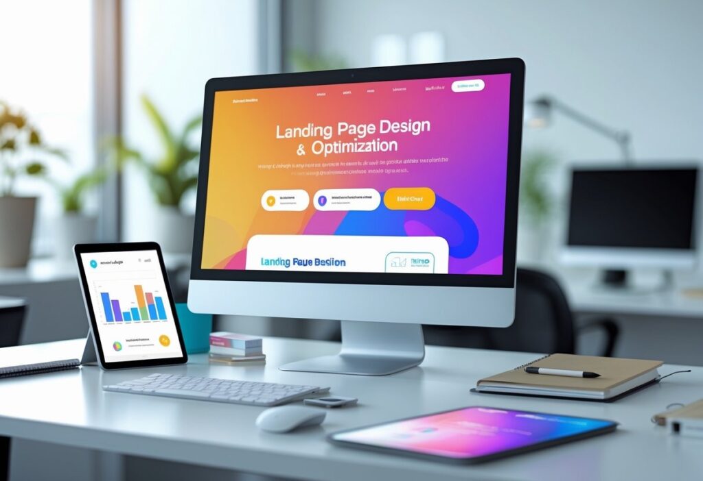
Key Benefits of Prototyping for Website Redesign Efforts

Prototyping brings a bunch of benefits for website redesigns:

  • Early Testing: Catch navigation and usability issues before the real build.
  • Clear Communication: Visual models get everyone, marketers, designers, developers, on the same page.
  • Reduced Costs: Find flaws sooner so you don’t pay for them later.
  • Faster Approvals: Stakeholders see working samples, not just flat images.
  • Better User Experience: Real feedback shapes designs that actually work for users.

The Role of UX Prototyping in Modern Redesign Workflows

UX prototyping puts the user’s journey front and center. Teams can simulate how people click around, test navigation, and see if content makes sense. This way, marketing sites aren’t just pretty, they’re actually usable and meet what visitors expect.

These tools make it easy to test and tweak user flows. Teams start with basic wireframes, then move to more detailed, interactive versions as the project moves along. This keeps usability testing focused and cuts down on guesswork.

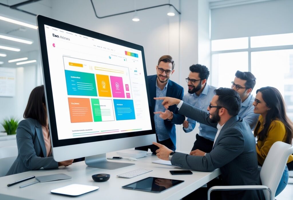
Collaboration Between Marketers, Designers, and Developers

Smart prototyping really brings marketers, designers, and developers together. Interactive prototypes turn fuzzy ideas into something you can actually see and click, making goals much clearer.

Marketers jump in early with content and business needs. Designers shape those into layouts. Developers give feedback on what’s possible and help avoid tech headaches. This kind of collaboration means fewer surprises and features don’t get missed.

When teams use shared prototyping tools, everyone can comment and make changes as they go. It keeps things transparent and smooths the handoff to development. The result? Less waiting around and a better-performing site in the end.

Essential Prototyping Tools and Methods for Redesign Success

Picking the right prototyping tools and methods can make or break a website redesign. Using both low- and high-fidelity prototypes, along with solid UX prototyping tools, helps teams move faster. Mixing rapid prototyping with ongoing testing keeps websites user-focused and saves both time and cash.

Low-Fidelity vs High-Fidelity Prototyping

Low-fidelity prototypes are basically sketches or wireframes. They nail down layout and page flow, skipping the fancy graphics and interaction. Teams can change these fast and get early feedback on structure and usability, no big investment needed.

High-fidelity prototypes are the opposite; they look polished, with real colors, images, and clickable stuff. These are great for testing user actions and final design details before building anything for real.

Most teams start simple, then ramp up the detail. This step-by-step approach keeps things moving and avoids expensive do-overs late in the game.

Top UX Prototyping Tools for Marketers and Designers

There are a bunch of great UX prototyping tools out there, and they make redesigns way easier:

  • Figma lets teams work together live in the cloud, with interactive prototypes and reusable design systems that speed things up.
  • Adobe XD is popular for sharing and building both wireframes and high-fidelity prototypes. It’s got plenty of features for UI/UX design.
  • InVision is all about quick, clickable prototypes, perfect for getting early feedback.
  • Webflow goes a step further, letting you design and develop at the same time. You can even publish prototypes live, so handoff is almost instant.

These tools offer version control, commenting, and connect with project management apps. The best fit depends on your team and how much detail you need.

Integrating Rapid Prototyping and Iterative Testing

Rapid prototyping lets teams build quick versions and test them over and over. This cycle, make, test, fix, helps marketers find problems early and keep designs user-friendly.

Testing interactive prototypes catches layout issues, missing features, or confusing menus before launch. Tools that mimic real clicks and scrolls make the whole thing feel real for testers.

Each round of testing leads to smaller, manageable updates. This keeps redesigns moving and builds confidence before the real development starts.

Best Practices for Usable and Functional Website Prototypes

The best prototypes balance looks and function. Start with wireframes that show clear navigation and content spots, don’t get distracted by colors or fancy fonts right away.

Clickable elements like buttons and forms are a must. They let you test if real users can actually get things done on the site.

Set time limits for each prototype version. Don’t chase perfection, reuse design components to save time and keep things consistent.

When you collect feedback, keep it focused and clear. Built-in collaboration tools help everyone stay in sync and speed up the redesign.

Want to dig deeper? Check out more UX prototyping tools for better collaboration and smoother redesigns.

Frequently Asked Questions

Smart prototyping lets teams test ideas fast and polish the important stuff early. It cuts delays, saves money, and helps marketers and designers actually work together. With the right tools, website redesigns run more smoothly and align better with business goals.

What are the major advantages of using smart prototyping in the website redesign process for marketers?

Smart prototyping shortens timelines, removes confusion, and uncovers issues early, long before costly development begins. 

Many teams rely on Impremis to build clickable prototypes that align everyone on layout, content flow, and UX before anything goes into production.

How does prototyping contribute to the user experience (UX) during a website overhaul?

Prototyping reveals UX issues early, helping teams fix navigation gaps, confusing layouts, and broken flows before launch. 

A strong user experience boosts engagement and conversions, which is why brands often turn to us for UX-led redesigns that put the visitor first from day one.

What are the best tools available for UX prototyping when planning a website redesign?

Figma, Adobe XD, InVision, and Webflow all help teams build interactive prototypes quickly. These tools make collaboration simpler and bring ideas to life much sooner. 

If you’re unsure where to start or need help selecting the right workflow, you can reach out to Impremis for expert prototyping and redesign support.

The Faster Way To Accelerate Your Website Redesign

If you want smoother redesigns, faster approvals, and a website that’s built around real user needs, smart prototyping is the way forward. The team at Impremis can help you streamline your entire redesign workflow with better UX planning, interactive prototypes, and development-ready designs that cut months off traditional timelines.

Whether you’re planning a full rebuild or optimizing an existing site, you can connect with our web design experts for tailored guidance. A smarter redesign process means fewer delays, and a high-performing site that launches faster and converts better.

Building landing pages that actually convert leads is a must if you want to grow your business online. A good landing page sticks to one goal and guides visitors to act, sign up, buy, download, whatever you need. 

If you want steady lead generation, you need a design that’s clear, trustworthy, and has strong calls to action.

Great landing pages use simple copy and clean layouts that don’t distract people. Social proof, mobile optimization, and fast load times help keep visitors interested. You’ve got to test and tweak things regularly if you want your page to work for everyone.

If you align your page content with what users actually want, you’ll see better conversion rates. Stick to what works and you’ll get more than just visitors, you’ll get real leads.

Key Takeways

  • Clear, focused messaging makes people act.
  • Trust signals and mobile-friendly design keep visitors engaged.
  • Keep testing and match user intent to boost conversions.

Key Elements of Landing Pages That Consistently Convert

Strong landing pages have clear goals, grab attention fast, and build trust so people want to take action. They walk visitors through what to do, step by step, without anything getting in the way. Make forms quick and easy, and use trust signals to show people they’re making a smart choice.

Defining Your Landing Page Goal and Audience

Start by picking one clear goal for your landing page. Maybe you want emails, free trial signups, or direct purchases. Every single thing on the page should push that goal, don’t let anything distract from it.

Know your audience. Figure out what they need, what bugs them, and what they like. If you’re targeting small business owners, you’ll use different words and offers than if you’re talking to students.

When your content matches what your users want, conversions go up. Your design and CTAs should always point people straight to that goal.

Crafting Compelling Headlines and Subheadlines

Your headline is the first thing people see. Make it short, direct, and focused on the main benefit. Something like “Get 30 Days Free – No Credit Card Required” grabs attention and gets people interested.

Subheadlines back up your headline with extra details or reassurance. They help explain why your offer matters. Both should speak directly to your reader and make your selling point obvious.

Action words and a little emotion help keep people reading. Don’t use jargon. Keep it simple and put these lines front and center so nobody misses them.

Building Trust With Social Proof and Trust Signals

Trust is everything. Add testimonials, customer logos, and star ratings to show real people like your offer. Actual quotes with names and photos make it believable.

Trust badges, security certificates, money-back guarantees, awards, all help people feel safe. Show off any press mentions too. Put these next to your form or CTA to give people that last push they need.

Keep the design clean so these trust signals stand out, not get lost in clutter.

Optimizing Forms for Seamless Lead Capture

Your form is where you catch leads, so it should be quick and painless. The fewer fields, the better, usually just name and email is enough at first.

Use clear labels and make sure fields are big enough for phones and tablets. Autofill is a nice touch to speed things up even more.

Make your submit button pop with a clear action, like “Get My Free Guide” or “Start Your Trial”. Put your form above the fold, and on longer pages, repeat your CTA so people always know where to click.

Try out different form styles and lengths to see what your audience likes best.

Landing Page Design and Optimization Best Practices

The best landing pages are clear, fast, and built for user engagement. Every detail, from layout to where you put your CTA, matters if you want people to convert. Optimization isn’t a one-time thing; you’ve got to keep working at it.

Creating a Clean and Distraction-Free Layout

Keep your design clean. Cut out anything that doesn’t help your offer. Fewer distractions mean people focus on what you want them to do.

Use white space to break up sections and make the page easy to scan. Add high-quality images or video if it helps your message, but don’t let visuals take over. Show the value of your offer, downloadable resource, free trial, demo, whatever it is.

Don’t clutter your page with too much text, pop-ups, or a bunch of CTAs. Short, simple forms work best. Only ask for what you really need. This layout makes it easy for users to spot your CTA and act.

Strategic Placement of CTAs and Above-the-Fold Content

Make your CTAs bold and easy to find. Put your main CTA above the fold so visitors see it right away. Use button copy that’s specific, like “Get your free trial” or “Download the guide.”

Above-the-fold content should quickly explain your offer. Use a clear headline, a short supporting line, and maybe a testimonial or trust badge. Bullet points help highlight benefits fast.

If you want, add a secondary CTA lower on the page for people who read more. But don’t overdo it, one or two CTAs is enough. Too many just confuse people.

Enhancing User Experience With Fast Load Times and Mobile Optimization

If your page loads slow, people leave. Speed really matters. Compress images and trim down your code to make things faster.

Design for mobile from the start. Tons of visitors use their phones, so your page needs to look good and work well on small screens. Use big buttons, readable fonts, and simple navigation.

Google loves fast, mobile-friendly pages, so you’ll get more search traffic too. Speed and usability go hand-in-hand for landing pages that generate leads.

Continuous Testing and Data-Driven Improvements

No landing page is perfect right out of the gate. Run A/B tests on headlines, CTAs, images, and layouts to see what actually works. Tools like Hotjar and heatmaps show you how people use your page.

Watch your bounce rate, time on page, and conversion rates. If people leave fast, you might need a clearer offer or better visuals.

Keep checking your data and update your page regularly. That’s how you get a landing page that fits your marketing campaigns and actually converts. For more ideas, check out these landing page best practices.

Frequently Asked Questions

Strong landing pages have clear messages, simple navigation, and fast performance. They use solid CTAs and smart design to guide visitors to act, without distractions.

What are the essential elements of a high-converting landing page?

A strong landing page has a clear headline, benefit-driven copy, and CTAs that stand out. Trust signals like reviews and security badges help visitors feel confident before submitting their info. If you’re unsure where to start, this team can help you build pages designed for higher conversions.

How do you design a landing page that effectively captures lead information?

Short, simple forms almost always convert better. Ask for the minimum information you need and make sure everything works smoothly on mobile. Many brands rely on Impremis to build landing pages with clean UX, fast performance, and friction-free forms that increase lead volume.

What are the best practices for optimizing landing page performance?

Fast load times, mobile-friendly layouts, and strong message-match between ads and landing pages are key. Continuous A/B testing also helps you find what truly resonates. If you want expert help refining performance, you can reach out to us for a data-driven optimization strategy tailored to your goals.

Strengthen Your Landing Pages With Expert Conversion Support

If you want landing pages that generate leads consistently, the right design and optimization process makes all the difference. The team at Impremis can help you refine your messaging, improve your layouts, and build mobile-ready pages that convert at a much higher rate.

Whether you’re looking to overhaul a funnel or simply boost performance on your top campaigns, you can connect with our landing page specialists for tailored guidance. Better design leads to better conversions, and your best results start with a stronger landing page experience.

Paid media campaigns really depend on solid user experiences, and responsive web design is a huge part of that. When your ads send folks to a website that just works, no matter what device they’re on, they’re way more likely to stick around and actually convert. 

A responsive website gives your paid media a real shot at success across all screen sizes, especially mobile, where most of your traffic probably comes from these days.

Mobile responsive ads and optimized landing pages cut bounce rates and speed up load times. That helps your ad quality scores and ROI. If your site isn’t responsive, you’re just throwing away potential customers who get frustrated with slow or clunky pages on their phones.

Brands that nail responsive design get smoother branding and reach more people. You don’t have to pay for a bunch of different site versions, either. It’s just a smarter, more efficient way to keep up with how people actually browse.

Key Takeaways

  • Responsive design boosts ad engagement by working on all devices.
  • Mobile-optimized ads lower bounce rates and lift conversions.
  • Consistent, scalable design helps paid media keep winning long-term.

The Critical Role of Responsive Web Design in Paid Media Results

Responsive web design shapes how your paid media campaigns perform. When your site works smoothly on mobile, loads fast, and connects ads to landing pages without a hitch, you’re set up for more conversions. All these little details add up and make a big difference in your results.

How Responsive Web Design Boosts Paid Media Performance

Responsive web design means your site looks good and works well on any screen, especially phones, which now get most of the clicks anyway. When landing pages adjust on the fly, people get faster load times and easier navigation. That keeps them from bouncing and helps them move down the funnel.

Better mobile usability just makes people happier, and happy visitors are more likely to do what you want, like fill out a form or buy something. Responsive sites also help with core web vitals, so you get better page rankings and ad quality scores. That can mean lower ad costs and more eyeballs on your ads. It’s a win-win for your ad spend and conversion rates.

Mobile Optimization for Paid Ads and Landing Pages

Mobile optimization isn’t just about shrinking stuff down. It’s about making sure ads and landing pages load super fast and look right, without weird errors. Slow or buggy mobile pages are a surefire way to lose people.

Google cares a lot about page speed for ad rankings. If your landing page is slow, people bail before you even get a chance. Mobile-friendly designs that keep images and scripts light help you win those precious seconds and keep users moving from ad to page without friction.

A solid mobile landing page keeps things simple and makes actions, like buying or signing up, easy. Less hassle means more conversions. That’s why mobile optimization is just non-negotiable for paid media.

Responsive Design Strategies for Mobile-First Campaigns

Mobile-first design puts mobile users right at the center. It’s about keeping things simple, clear, and quick to find, even on a tiny screen. That’s where your audience is anyway.

Good strategies use flexible grids, scalable images, and content that adapts to whatever device people have. Testing on lots of devices helps you spot problems before launch. If mobile usability feels seamless, people move through your conversion funnel without getting stuck.

When you focus on mobile users first, you get more engagement and better conversion rates. Responsive design that follows mobile-first thinking helps your paid media campaigns deliver better returns because everything just works, no matter where people find you.

Want to dig deeper? Check out The Importance of Responsive Web Design in 2025.

Key Benefits and Best Practices of Responsive Web Design for Paid Media

Responsive web design helps your paid media work by making sure ads and landing pages don’t break on any device. You get lower bounce rates, faster load speeds, and a boost for your SEO. Developers use flexible layouts and smart tools to keep sites easy to update and ready for the future.

Improved User Experience Across Devices

Responsive design uses fluid grid layouts and flexible images that automatically fit any screen. No more awkward scrolling or weird navigation. Mobile users especially love big, easy-to-tap buttons and simple menus. That’s what gets them interacting with your ads and landing pages.

Fast-loading pages keep people from bouncing, which is huge for paid campaigns. When visitors stick around and click more, you see better conversion rates. CSS media queries help content rearrange for different screens, so everyone gets a good experience no matter what device they’re on.

SEO and Mobile-First Indexing Advantages

Search engines love mobile-optimized sites, and mobile-first indexing is the new normal. Responsive websites that load fast, look right, and keep content consistent dodge penalties for duplicate content and bad usability. That means better SEO rankings and more organic traffic, so you don’t have to rely only on paid ads.

Performance tricks like caching and compressing images also help with faster load times (and Google notices). Running just one responsive site saves time and money compared to juggling separate desktop and mobile versions. Plus, it helps your search rankings and ad quality scores.

Tools and Frameworks to Build Responsive Sites

Frameworks like Bootstrap, Foundation, and Tailwind CSS make it easier to build responsive layouts. You get pre-made components, so you spend less time coding and more time making sure your site works everywhere.

Testing tools like BrowserStack, Responsinator, and Google Mobile-Friendly Test let you see how your site looks on different devices. Catching issues early means your ads and content won’t flop. Keep an eye on things with analytics, too, so you know performance stays solid.

Mixing these tools with best practices, like CSS media queries and smart image optimization, gets you responsive sites that load fast, keep users happy, and make your paid media campaigns work harder for you.

Frequently Asked Questions

Responsive web design makes your ads look and work better across all devices, especially phones and tablets. It helps your website adapt to any screen size, so ads are easier to see and click. That flexibility leads to better engagement and, hopefully, more conversions.

How does responsive web design enhance the user experience for mobile ad viewers?

Responsive design ensures every ad click leads to a page that loads correctly and feels natural to use. Touch-friendly navigation, scalable images, and readable layouts all reduce bounce rates. 

If you need help identifying mobile UX issues, our team can review your site and recommend improvements that directly support your paid media results.

What are the advantages of using responsive design in improving conversion rates from paid media campaigns?

When mobile visitors land on pages that fit instantly, they’re far more likely to complete the action your ad promised. A single, responsive site strengthens SEO, lifts ad quality scores, and builds trust through consistent design. 

Many brands partner with Impremis to fine-tune responsive layouts that increase form fills, sales, and overall campaign efficiency.

In what ways does mobile optimization of ads affect click-through and engagement rates?

Mobile-optimized ads load quickly and look clean on any device, which helps users understand your message without extra friction. Clear layouts and fast responses drive higher engagement and stronger CTRs. 

If improving mobile performance feels overwhelming, you can always reach out for expert support in aligning ad creative and landing pages.

Improve Your Responsive Experience to Boost Paid Media Results

A responsive, mobile-ready website makes every ad perform better. If you’re ready to tighten load times, fix mobile friction, or refine your landing pages for higher ROI, the team at Impremis can help you build a smoother experience that strengthens your paid media performance.

Whether you need a full responsive redesign or targeted updates to improve engagement, you can connect with our web experts for guidance built around your goals. 

Better responsiveness means better conversions, and it starts with the right support.

Every e-commerce site wants higher conversion rates, right? UX design is at the heart of getting there. If your site’s navigation is clear, loads fast, and feels easy to use, you’re already nudging visitors closer to buying. Good UX clears away the junk that stops people from finishing a purchase, so more visitors actually become customers.

UX isn’t just about making a site look pretty. It’s about making it work for real people, on any device. Trustworthy design, clear calls-to-action, and a mobile-friendly setup boost confidence and get folks clicking. If you stick to proven UX best practices, you’ll keep people coming back, and you won’t need to blow your budget on ads.

People expect online shopping to be smooth and hassle-free. Regular testing and tweaks help your site keep up. Here are five UX design principles that’ll make your e-commerce experience better and get those conversion rates up.

Key Takeaways

  • Simple, clear design leads to more clicks and more sales.
  • Trust signals and mobile-friendly layouts make shoppers feel safe.
  • Testing and tweaking keep conversions growing.

Essential UX Design Principles for Higher Website Conversion

Want more conversions? It comes down to smart design choices. You need clear signals that guide users to the right actions. Navigation should just make sense; no one likes getting lost on a site. Trust grows when people see proof you’re legit and that their info’s safe.

Mobile and responsive design keep things smooth, no matter what device someone’s using. That keeps people engaged and less likely to bail.

Clear Calls-to-Action and Optimized CTA Placement

Calls-to-action (CTAs) are your money-makers. They need to be obvious, short, and tell people exactly what to do, think “Buy Now” or “Get Your Quote.” If your button language is active, people hesitate less and click more.

Where you put CTAs matters, keep them above the fold so nobody misses them. Use a color that pops and give the button some breathing room. Don’t cram the page with too many CTAs; one clear goal per page is enough.

Try out different button colors, words, and sizes with A/B testing. You’ll see what your audience actually likes, not just what you think works.

Streamlined Navigation and Intuitive User Journey

Navigation should make the user journey easy. Menus work best with 5-7 main items; more than that and people get overwhelmed. Stick to labels everyone recognizes so nobody has to guess.

Group related pages together. Most users expect the menu up top or on the left. Add a search bar for folks who know exactly what they want.

Keep things flowing. The fewer hoops users jump through, the more likely they’ll stick around and buy. Use familiar design patterns so people know what to expect.

Building Trust Through Social Proof and Trust Signals

Trust is everything. If your site feels reliable, people are way more likely to buy. Show off testimonials, reviews, or case studies; let your happy customers do the talking.

Display SSL icons, payment badges, and partner logos to show that you take security seriously. Stick to consistent colors, fonts, and tone for a professional vibe.

Be clear and honest in your messaging. If people believe you’ll deliver, they’ll stick around and convert.

Responsive and Mobile-Optimized User Experiences

Mobile traffic is huge now. If your site isn’t responsive, you’re missing out. Mobile layouts should focus on what matters: big buttons, easy navigation, and no clutter.

Start designing for mobile first, then scale up. Avoid heavy graphics that slow things down. Fast load times and simple touch controls keep users happy.

Test your site on real devices, not just emulators. Responsive design shows you’re serious, and it builds trust no matter what device people use.

Want to dive deeper into high-converting CTAs? Check out this UX design guide for conversions.

UX Best Practices for E-commerce Conversion Optimization

Great ecommerce design guides users with clear priorities and easy-to-read content. Use graphics and copy that highlight what matters, don’t overwhelm shoppers. A smooth path to purchase means more sales and better feedback for ongoing tweaks.

Visual Hierarchy and Effective Use of Graphics

Visual hierarchy shows users what matters most. Bigger fonts, bold headlines, and bright colors pull attention to CTAs like “Add to Cart.” It helps people find what they want fast.

Use sharp product photos from different angles. Lifestyle pics can build trust and help people picture themselves using your stuff. Every graphic should have a purpose; ditch anything that just adds clutter.

White space and straight alignment keep things clean. Grids help organize content. When you combine a strong hierarchy with the right graphics, users move smoothly through your site and checkout.

Color Schemes, Typography, and Readability

Colors set the mood and shape your brand. Contrasting colors make CTAs stand out and get more clicks. Stick to neutral backgrounds with pops of color for action items.

Pick fonts that are easy to read, sans-serif usually works best online. Make sure text is big enough, especially for product info and buttons.

Space out lines and break up paragraphs. Use bullet points and short sentences to make info skimmable. Nobody reads giant blocks of text. Consistent styles build your brand and make the site easier to use.

Accessibility and Progressive Disclosure

Accessibility means everyone can use your site, including people with disabilities. Design for keyboard navigation, screen readers, and color blindness. You’ll reach more people and get more sales.

Progressive disclosure keeps things simple. Show the basics first, then let users click for more details. For example:

  • List main specs up front, with “More Details” sections
  • Hide long policies, but link to them clearly
  • Only show extra form fields when needed

This gives users control and keeps them from feeling overwhelmed.

Continuous Improvement: Analytics, User Feedback, and A/B Testing

Check your site data often. See where people drop off and what’s working. Look at click rates, cart abandonment, and how long people stick around.

Ask users for feedback with surveys or usability tests. They’ll tell you what’s tripping them up, stuff you might never notice just looking at numbers.

Run A/B tests to compare different pages or elements. Try new button colors, words, layouts, or checkout flows. Let real results guide your choices.

Keep cycling through analytics, user insights, and testing. That’s how you keep conversions climbing and your ecommerce business growing. Want more strategies? Check out e-commerce UX best practices.

Frequently Asked Questions

Good UX design for e-commerce means clear navigation, quick load times, and trust signals that help users buy with confidence. Optimizing CTAs and making sure the site works on mobile are also huge for getting more conversions.

What are the top 5 UX design principles that can significantly improve e-commerce conversion rates?

First, keep navigation simple so shoppers find products fast. Fast-loading pages keep people from bouncing. Clear, bold CTAs nudge users to finish a purchase.

Trust signals like secure payment badges and consistent branding build credibility. And mobile optimization is a must, since more people shop on their phones every year.

How can UX design influence the conversion optimization process for websites?

UX design shapes every step of the customer journey. It removes blockers and makes the next steps obvious. Smart UX means testing layouts, copy, and button spots to see what actually gets results.

Easy-to-scan content and persuasive copy help answer questions and calm doubts, raising conversion rates. Keep analyzing and tweaking to stay ahead.

What are the best practices in UX for enhancing user engagement and conversion on e-commerce platforms?

Start with intuitive menus and a search that actually helps people find what they want fast. High-contrast buttons and links? Those make calls-to-action pop; no one should miss them.

Add alt text to images so everyone can shop, and show real customer reviews to boost trust. Keep form fields short, especially on mobile; nobody likes a checkout that takes forever.

When you sweat the small stuff, you create a seamless shopping experience that brings people back and nudges them to buy. If you’re not sure where to start, maybe it’s time to call in some web design pros who know these tricks inside out.

Optimize Your Website Experience With Expert Support

Improving UX is one of the fastest ways to lift conversions, but many teams aren’t sure which changes will make the biggest impact. 

If you want clearer navigation, stronger CTAs, or a smoother mobile experience, the team at Impremis can help you refine your site with data-backed improvements that move real numbers.

Whether you’re working on a full redesign or need quick wins that boost conversions fast, you can connect with our UX specialists for tailored guidance. A better user experience leads to better sales, and it starts with the right partner.

Shopping cart0
There are no products in the cart!
0