Most brands run email and paid media on separate tracks, but the companies that grow fastest understand that these two channels perform far better when they support each other.
When email and ads work together, brands see higher engagement, stronger conversions, and lower acquisition costs.
This guide breaks down exactly how to align email and paid media for maximum impact using simple, proven steps.
Key takeaways:
- Email and paid media perform significantly better when messaging, timing, and audiences are aligned.
- Coordinated campaigns build recognition and reduce friction, boosting conversions across channels.
- A clear framework makes cross-channel marketing easier to implement at any scale.
Why Email–Paid Media Alignment Matters
Email remains one of the highest-ROI marketing channels, and paid media gives brands fast reach and targeting. When they operate together, they reinforce each other’s strengths.
Research from Statista’s digital marketing effectiveness benchmarks shows that consumers often need multiple touchpoints before they convert. Email and ads working together create those touchpoints consistently.
Meanwhile, cross-channel coordination is highlighted in the Adobe Experience Cloud cross-channel personalization guide as a key driver of customer engagement and retention.
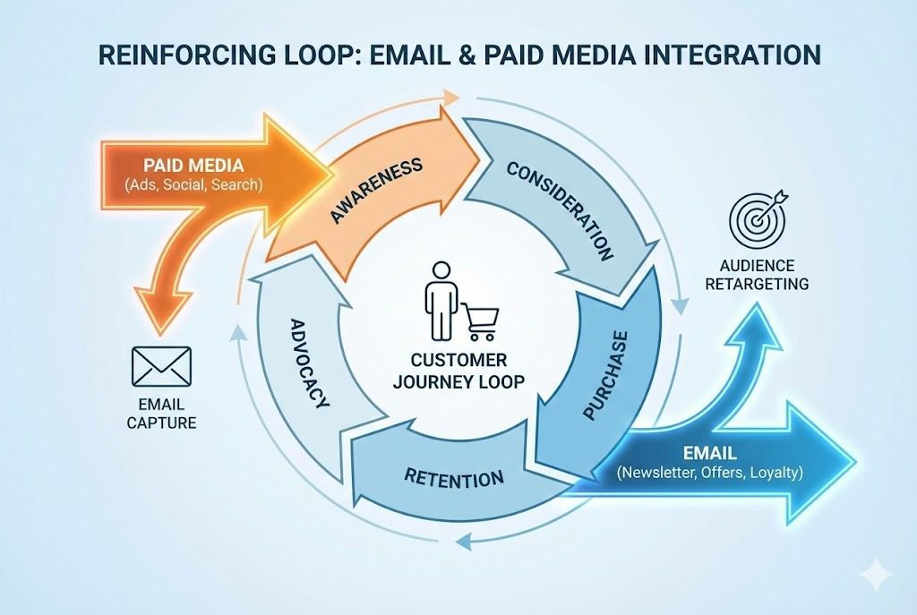
Together, email and paid media form a loop: ads bring people in, email nurtures them, and retargeting campaigns bring them back until they purchase.
How Email Enhances Paid Media Performance
Email supports paid media in several ways:
Builds trust faster
People who already received helpful emails recognize your brand instantly in ads. This increases click-through rates and lowers customer hesitation.
Improves ad relevance
Your email engagement data, opens, clicks, product interest, can inform your paid audiences. This ensures ads match what subscribers already care about.
Reduces acquisition costs
Warm audiences cost less to advertise to. When you sync email lists into ad platforms, your cost per click and cost per acquisition drop.
Supports full-funnel nurturing
Paid ads generate attention, but email closes the gap with reminders, education, and offers that speed up the buying process.
How Paid Media Improves Email Marketing
Paid media also strengthens email performance:
Grows high-quality subscribers
Well-targeted ads bring in better leads. When new subscribers join through clear, well-positioned offers, your open and click rates rise.
Re-engages inactive email contacts
Paid remarketing keeps your brand visible even when subscribers stop opening emails.
Creates consistent messaging across channels
By syncing your campaign themes, your ads and emails reinforce the same story, making your brand more memorable and trusted.
Supports product launches and big promotions
Paid campaigns help build momentum, and email captures the conversion.
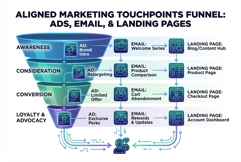
A Framework for Aligning Email and Paid Media
The most effective brands use a simple alignment system built on five steps:
| Step | What to Do | Why It Matters |
| 1. Sync audiences and lifecycle stages | Import email segments into ad platforms for warm retargeting | Makes ads cheaper and more relevant |
| 2. Match messaging and offers | Ensure ads and emails share consistent tone, visuals, and promises | Reinforces brand trust across channels |
| 3. Align timing | Plan campaign timelines so ads and emails support each other | Prevents channel conflicts and confusion |
| 4. Use cross-channel tracking | Track touchpoints across email, site visits, and ad impressions | Reveals which combinations produce the best ROI |
| 5. Optimize based on shared data | Use paid data to refine emails and email data to refine ads | Improves both channels over time |
This structure ensures every message feels intentional and seamless, not scattered or contradictory.
Email and Paid Media Alignment Examples
Coordinated product launch
- Ads build awareness and excitement.
Email delivers deeper product details and early access. - Retargeting ads follow subscribers who visited the site but didn’t convert.
Cart abandonment sequence
- Paid retargeting shows reminders or social proof.
- Email provides deeper reassurance (returns, FAQs, testimonials).
Together, they lift cart recovery significantly.
Re-engagement flow
- Email attempts to win back inactive subscribers.
- Paid remarketing touches users who no longer open emails.
Both channels reinforce brand visibility until a subscriber comes back.
Lead-nurture drip
- Ads reintroduce the brand after key interactions.
- Email shares more educational content that drives trust.
This accelerates the sales cycle without relying on email alone.
Tools That Help Sync Email and Ads
Modern ad platforms and email systems make cross-channel alignment easier than ever. Here are the most helpful tools:
- Customer match + audience uploads found in the Google Ads audience integration documentation help brands target subscribers with precision.
- Behavior-driven segmentation through email platforms ties user actions to ad audiences.
- Cross-channel personalization frameworks, outlined in the Adobe Experience Cloud personalization overview, help unify messaging at scale.
- Attribution and performance dashboards tie email clicks, ad impressions, and on-site behavior together.
These tools create better alignment while reducing manual work.
Common Mistakes That Hurt Email–Paid Media Performance
Many brands unknowingly lose performance due to misalignment. The biggest mistakes include:
- Running ads with one message and sending emails with another.
- Using different visuals or tone across channels.
- Not syncing email lists into ad platforms for lower-cost retargeting.
- Running email campaigns without supporting paid ads during key moments.
- Failing to track both channels together, leading to poor decision-making.
Avoiding these mistakes keeps campaigns clean, unified, and more profitable.
Action Steps to Align Your Next Campaign
A few simple steps can transform your results:
- Audit your email sequences and paid ads for message consistency.
- Sync your email list into paid platforms for warmer retargeting.
- Plan campaign calendars where email and ads support each phase.
- Use cross-channel tracking to measure how ads and emails interact.
- Review landing pages to ensure they match both ad and email promises.
This is also where a partner like Impremis can help, blending email strategy, paid media structure, UX, and conversion optimization into a cohesive system.
Frequently Asked Questions
How do you tell if email and paid media are aligned?
Look for message consistency, shared timing, and unified targeting. If one channel says something different than the other, friction appears. Impremis helps brands build unified messaging frameworks so ads and emails reinforce the same story and conversion path.
Is cross-channel alignment too complex for small teams?
Not when approached with a clear structure. Even small teams can align audiences, visuals, and messaging. Impremis often guides smaller brands through simple alignment systems that improve conversions without increasing workload.
Does cross-channel alignment improve conversion rates?
Yes. When email and ads work together, users feel more confident and move through the buying journey faster. Impremis enhances this by ensuring the landing experience, UX, and content match what the ads and emails promise.
Turn Your Email + Paid Media Into a Unified Growth System
If you want stronger conversions, lower costs, and a cleaner customer journey, aligning email and paid media is one of the fastest ways to get results. Impremis helps businesses connect campaigns, optimize messaging, and build high-performing cross-channel systems.
Explore strategy and capabilities at Impremis or connect with the team through the contact page to start building integrated campaigns that drive measurable growth.